Corporate Rebrand

In my undergraduate brand and identity systems course, I was tasked with redesigning the identity of a corporate brand. I chose to redesign the identity of the National Railroad Passenger Corporation, which does business as Amtrak.
The twentieth century saw a major decline in passenger rail transportation. By the 1960s, the industry was in crisis. Several railways discontinued passenger trains and routes. The fate of passenger rail was saved in 1970, when U.S. Congress passed the Rail Passenger Service Act. This legislation combined twenty passenger railroads into one privately-owned, publicly-controlled corporation: Amtrak.
Nearly everyone involved at the time expected Amtrak to be a brief experiment. A “last hurrah” for passenger trains.
As of 2025, Amtrak operates inter-city rail service in 46 of the 48 contiguous United States as well as nine Canadian cities.
Brand Assets
Logotype
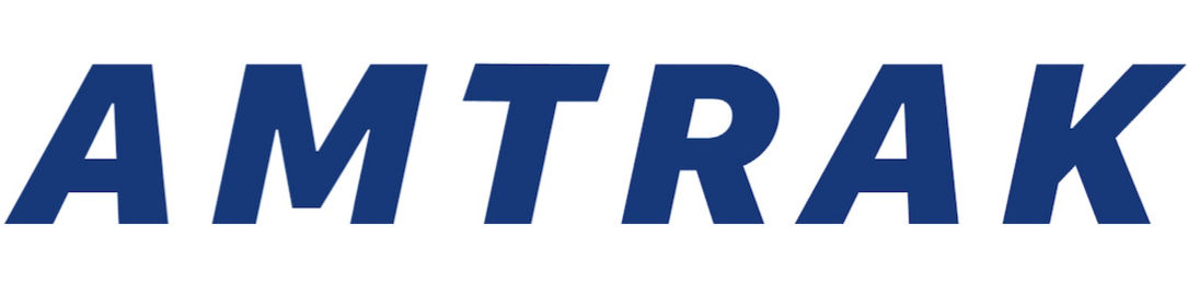
Amtrak’s logotype, pictured in Amtrak Navy, is set in a customized version of SF Pro Text Black Italic. The logotype is only to appear in one of two colors at any given time: Amtrak Navy when paired with the full color logomark, or Amtrak Sleeper Blue when paired with the Sleeper Blue logomark. The Amtrak logotype should never stand alone and should always accompany the logomark, either to its right or below it.
Logomark
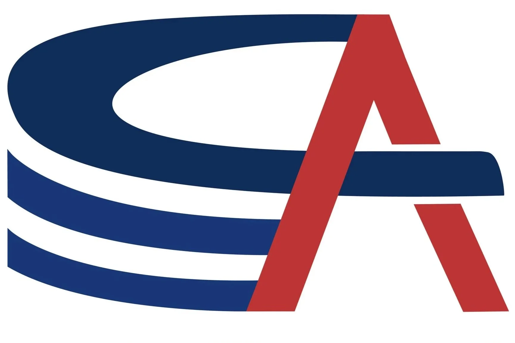
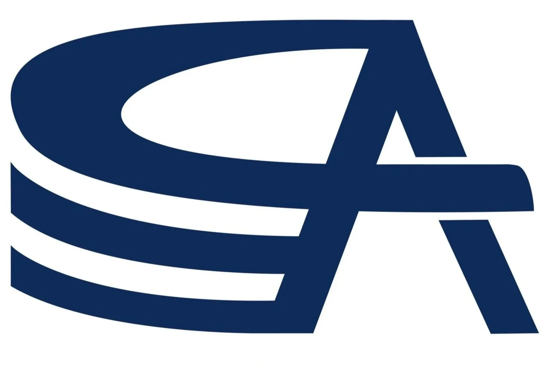
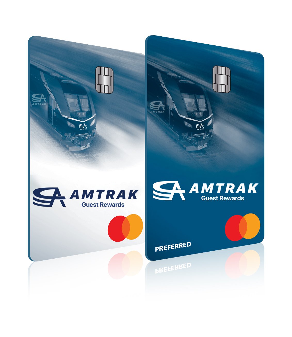
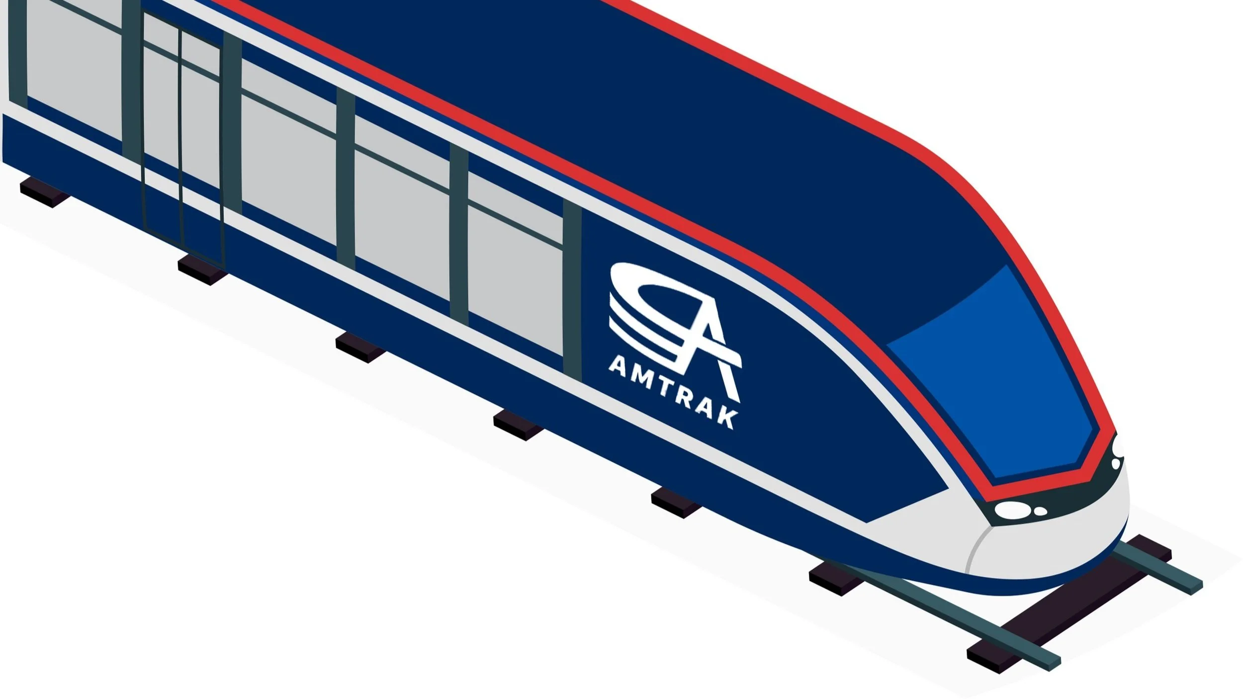
Amtrak’s logomark is pictured in two variations: full color and Sleeper Blue. Both variations are to be used against a light background. The choice of full color or Sleeper Blue is left to the discretion of corporate design teams on a case-by-case basis with a few exceptions. The full color variation is always to be used on informational screens inside Amtrak train cars and in all email correspondence; the Sleeper Blue variation is always to be used on business cards and physical train booklets and brochures. When working with a dark background, the logomark is to appear in white. The logomark can stand alone; a standalone logomark may work well when facing potential scaling visibility issues.
Combination Mark
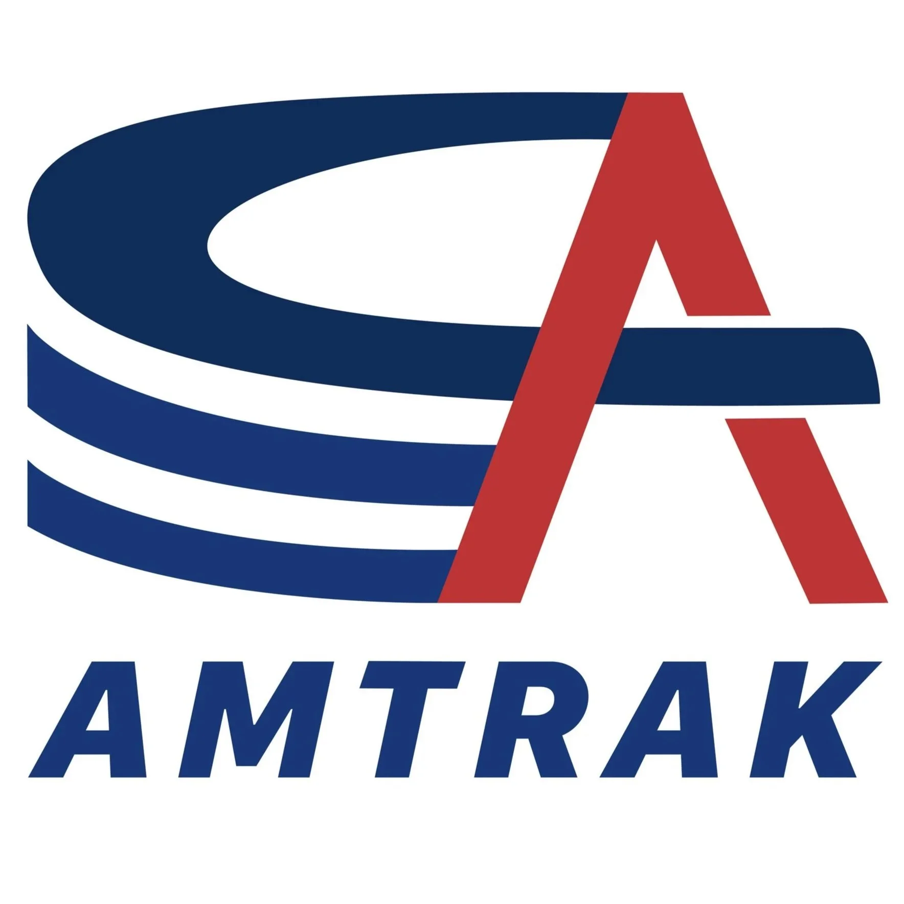
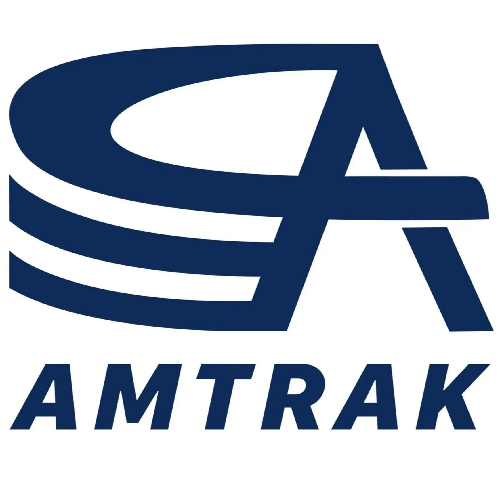
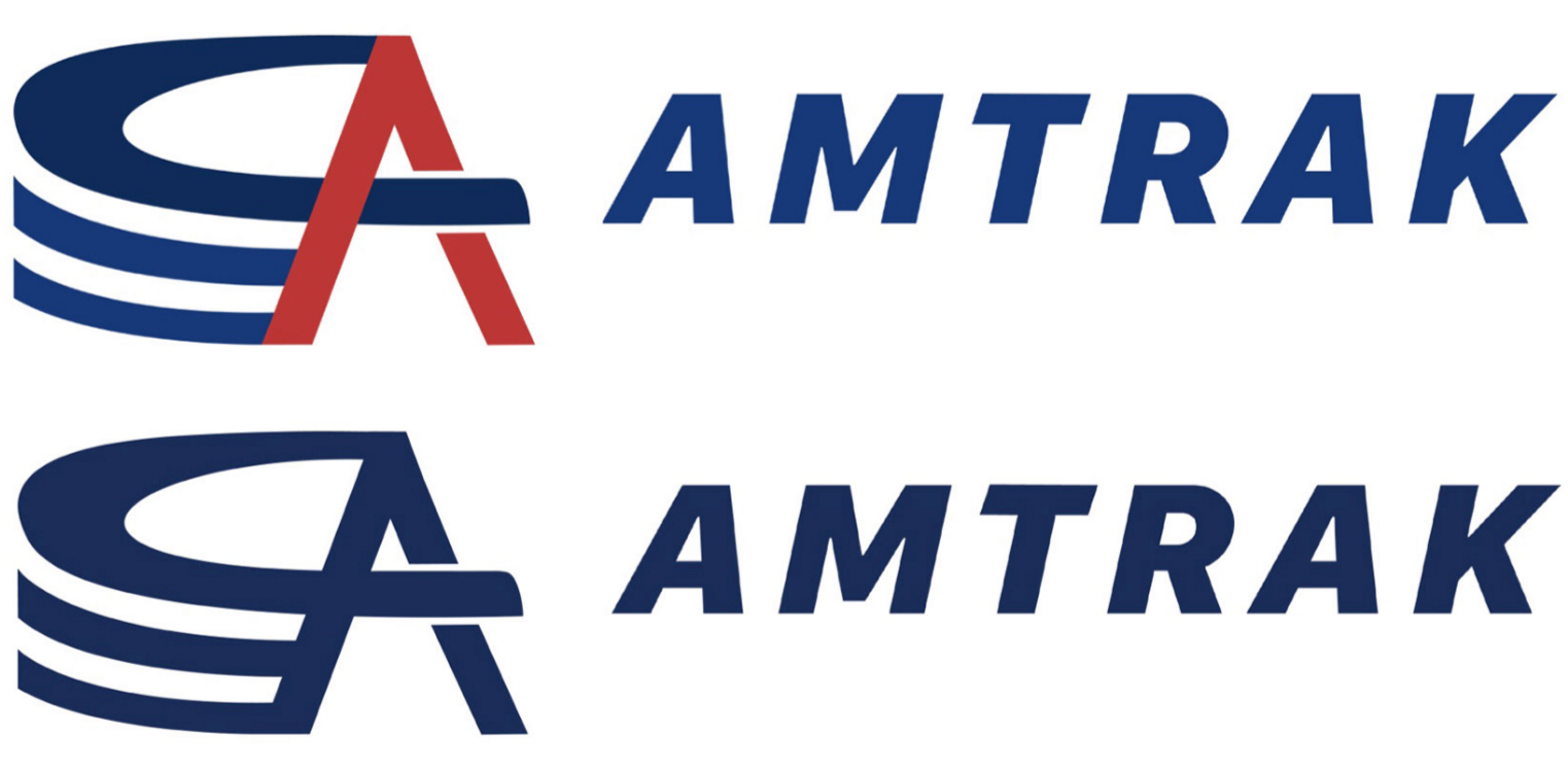
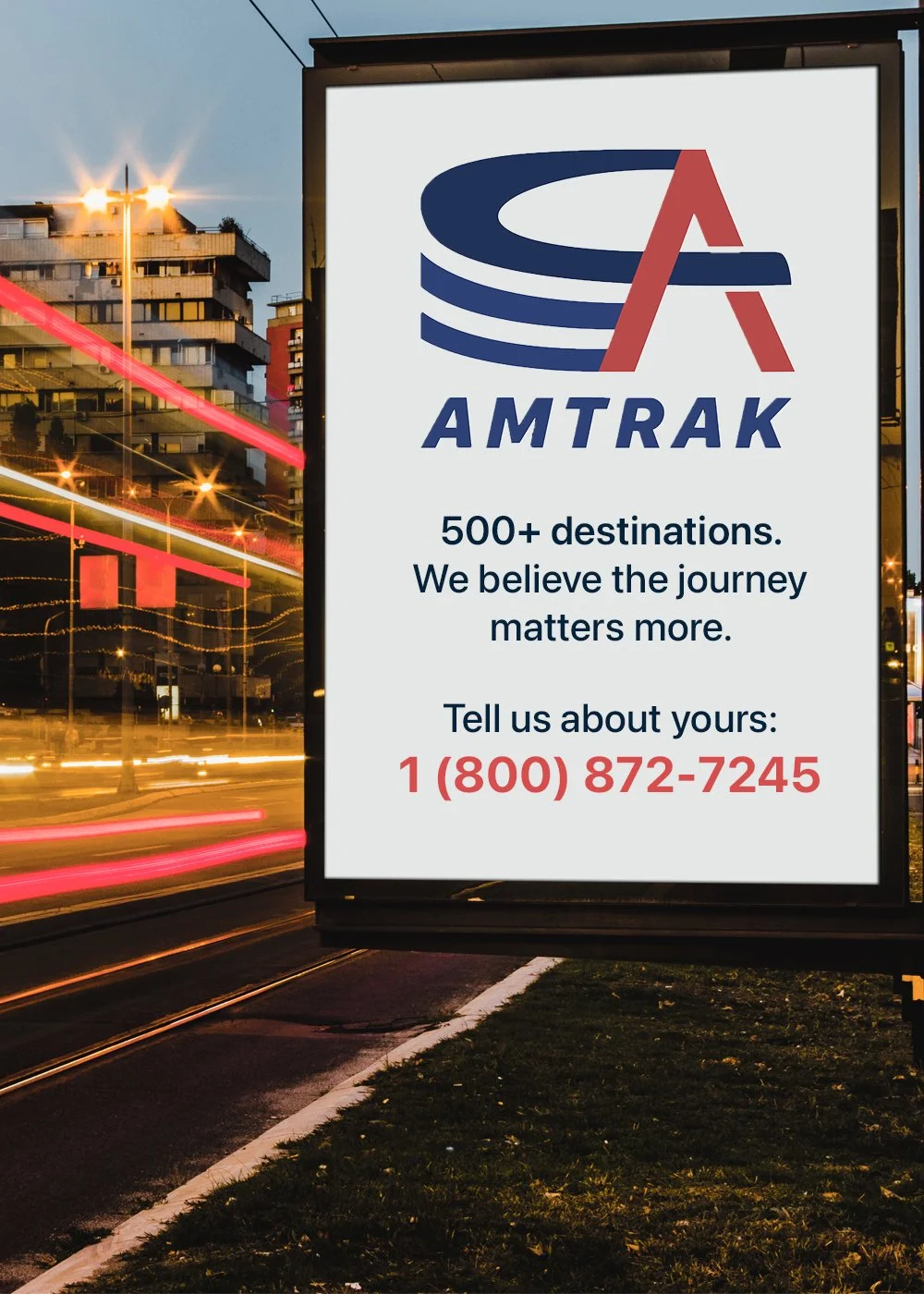
Amtrak’s combination mark exists in two variations: stacked and horizontal. These variations exist in two color schemes: full color and Sleeper Blue. Any of the four combination marks depicted here must be used against light backgrounds. When working with a dark background, the combination mark used must appear in white. The variation used (stacked versus horizontal) depends on the case-by-case space the brand is set to occupy. For example, when working with narrow spaces, the horizontal combination mark works well. The stacked combination mark can be used in a variety of dimension constraints.
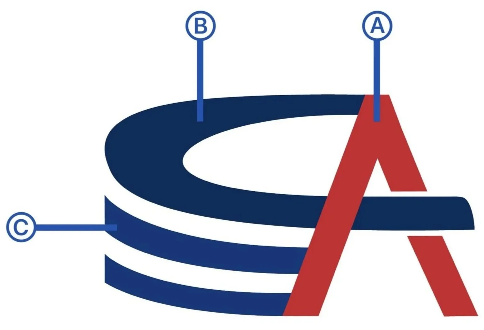
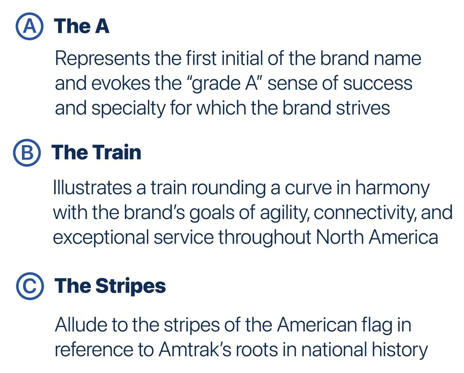
Logomark Symbolism
Typefaces
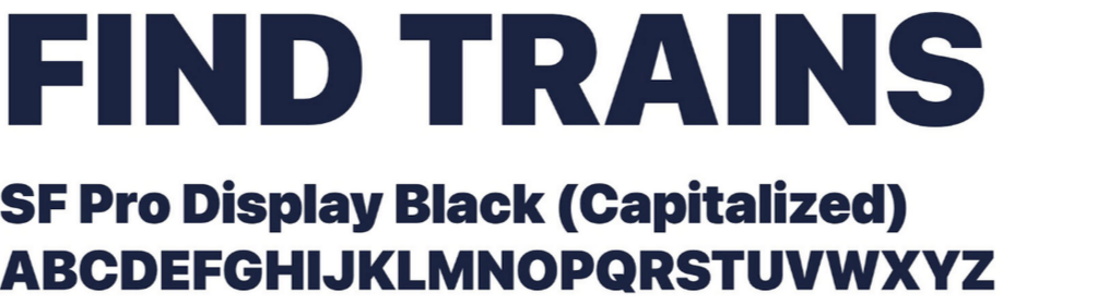
Headlines
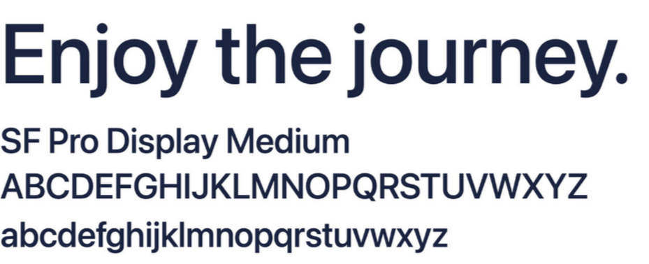
Body Copy
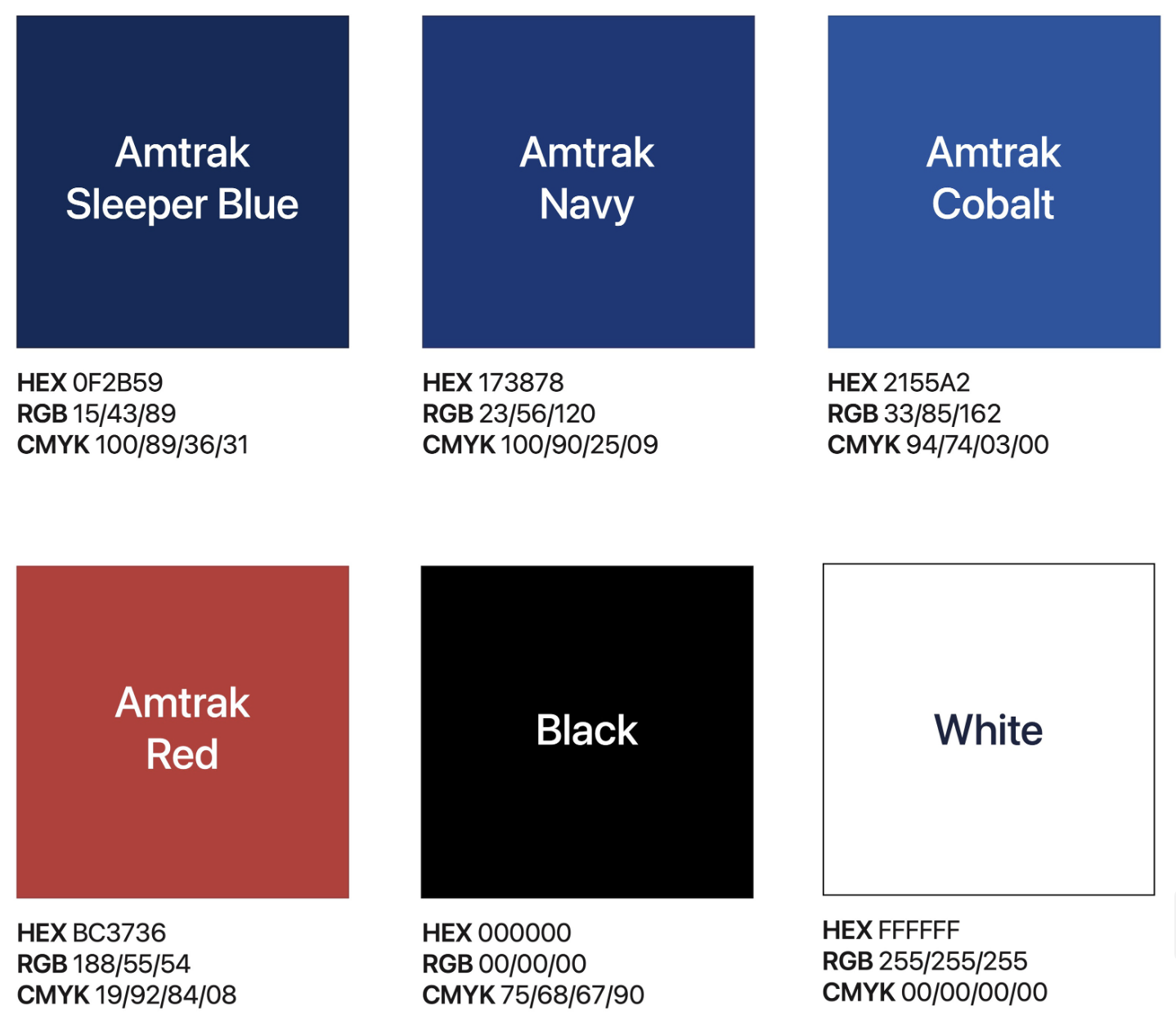
Color Palette